
Young Cooper Nicholson
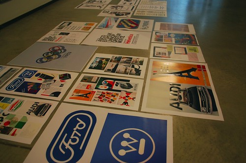
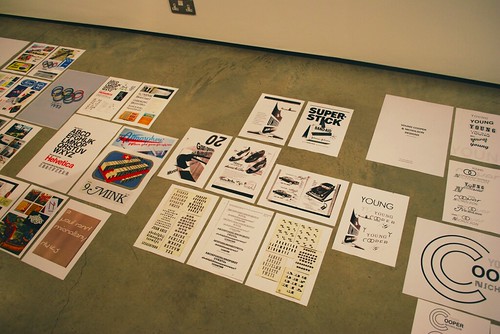
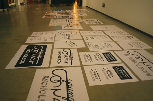
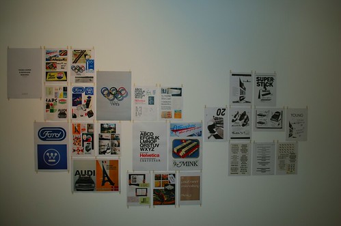
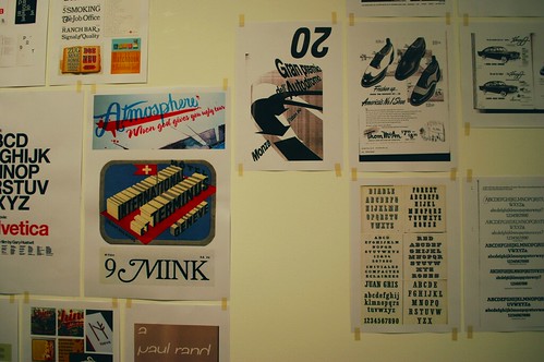
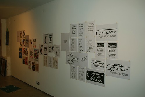
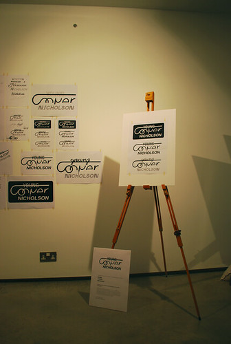
A project I was commissioned to do by Nick at YCN. It explores what YCN as an advertising agency in the late 1950s would look like. I wanted to get a real feel for what the 1950s were all about so completed some detailed research and found many beautiful graphics, logos and typefaces. The feel of the 50’s is very much about style and making things visually appealing with the use of multiple typefaces and striking icons. In my designs I took my favourite elements from my research and have ended up with a number of possible final solutions to the brief. As a whole though it is the journey which is the most exciting. Here are a few pics of me putting it up!
No comments:
Post a Comment