I know I havnt put much of my work up on my blog since I have been at MCAD but I am now putting it all up, I feel i have learnt a lot from being here, i have tried so many new ways of working and styles which at first was hard but Im really pleased with a lot of the work I have produced so far here. Im now entering my final days and classes and it is really sad but has been a great experience, i am definatley a better, stronger, more confident person and designer and have made some really great friends so although its sad i will always remember MCAD with smile :)
Typography Two
Project one -
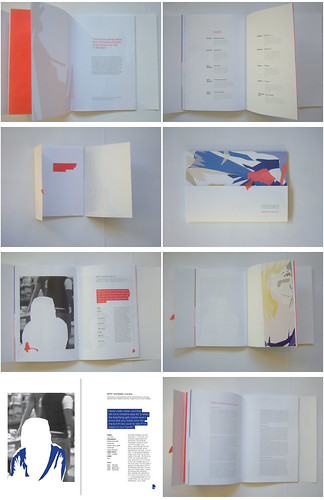
We had to make a music catalogue and i found this quite hard i had never really made a book, there were a number of problems to solve but looking back now im fairly pleased with it.
Project two -
We had fun with creative typography, i wanted to use cardboard letters as a statement at how much we can recycle, i then placed it in a thrift store to enhance the concept.

Project three -
We had to rebrand a company of our choice and i chose Kew an english clothing company, i had never really done a project like this so it was a challenge but i enjoyed it a lot and am pleased with the outcome.
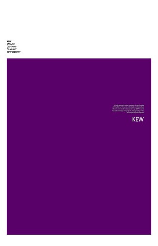
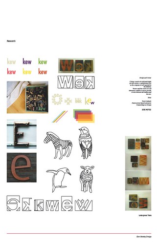
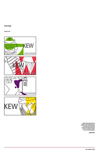
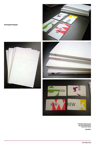
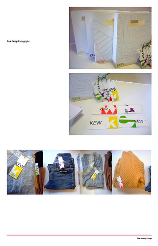
Photo Process in Print
Project one - "transformations"
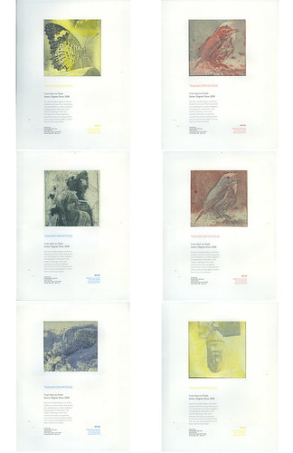
I chose to look at physical transformations like from baby to adult and baby bird to adult bird etc, i over printed to etching plates to create the image and then chose to add a design element to it by turning the prints into posters to advertise the exhibition for the latest graduating students.
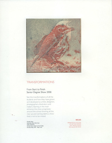
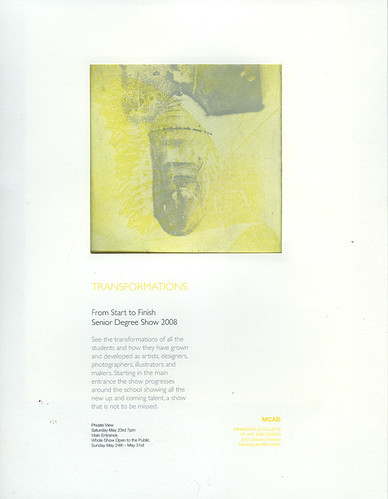
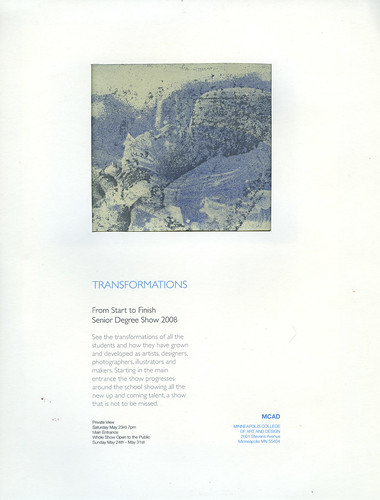
Project two - "Archives"
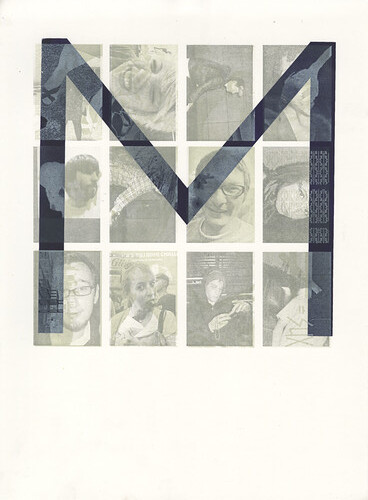
i decided that it was the people i met here that were what made this experience what it was so i wanted to use this project to archive some of my closest friends i had made here, each print has the letter M first representing, millie, mcad and minneapolis, each person has a different colour, then there are two layers of litho, one is there picture and the other something that reminds me of them. im really happy with them and look forward to giving them out to the 12 lovely people i made them for.

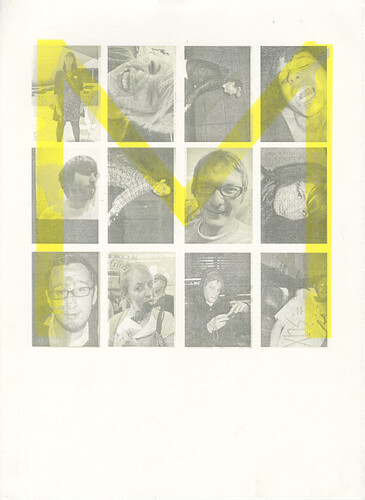
Project Three - "open"
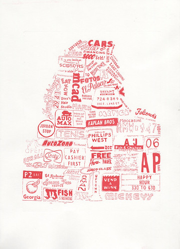
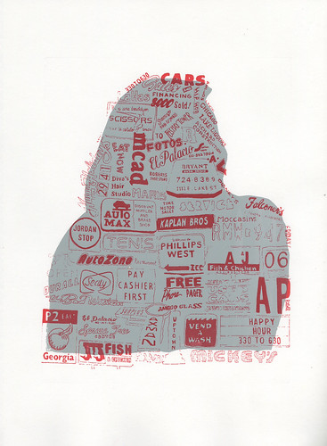
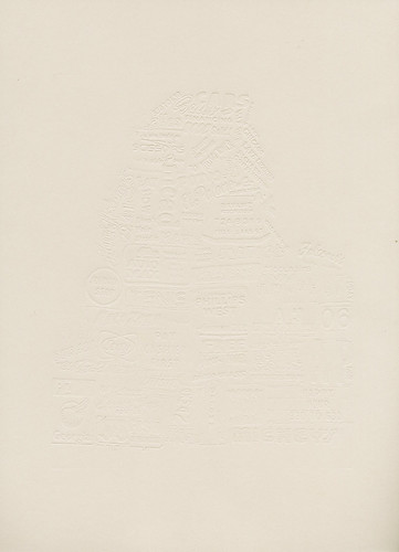
This was an open project where we just had to use polymer plates, text works really well with this print technique so i decided i wanted to use signage i had photographed since being here, its so different from that we have at home so i wanted to document it. i used a silhouette of myself to frame all the signs i then hand drew into the frame, i really like the outcome and even embossed a few which looks sweet.
Form Z Computer Modelling
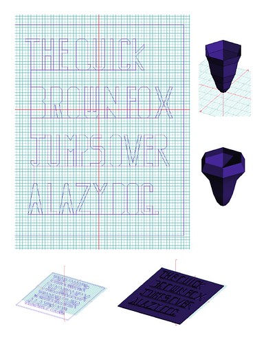
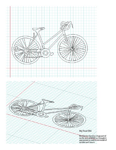
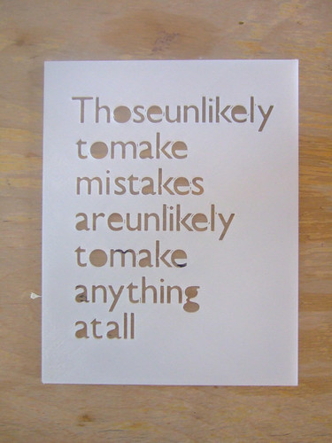
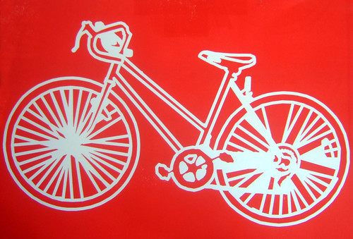
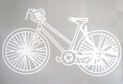
This was my most challenging class i am not great with computers but was really excited to learn about a more 3d aspect to design so i tried really hard and in the end came up with some good things which im pleased with including a plastic stencil and huge bike cut out which i then wood block printed :)


Copywrite for Advertising
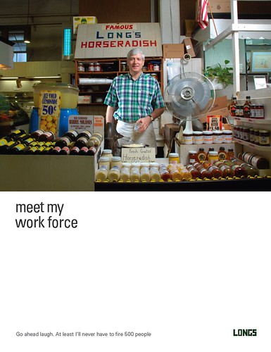
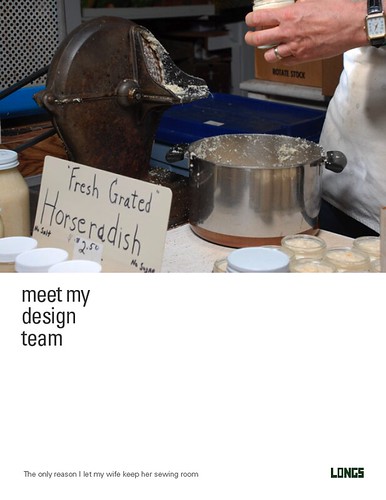
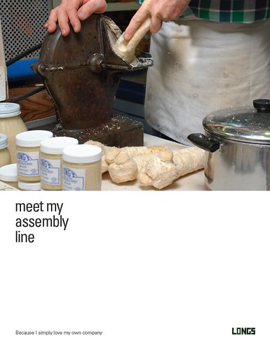
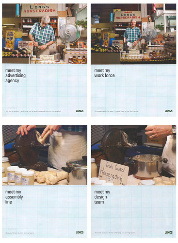
This was supposed to be my liberal arts class however there was no essay writing in this class it was definatley more of a studio class, but its been great. we have been working on just one project the whole time for the One Show competition which has been great, we had to come up with adverts to sell "Longs Horseradish" this is a one man company pretty much so was a challenge but the final ads work well.


Graphic Design Two
Project one - "Collage Project"
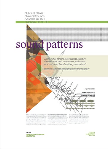
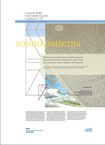
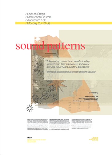
im not so keen on collage or wasnt until i took kindras first project that im actually quite fond of it. We had to chose a record and eventually make a series of posters for it using type and collage it was fun and i like my posters :)
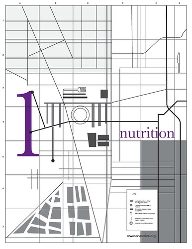
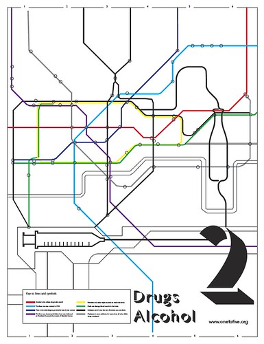
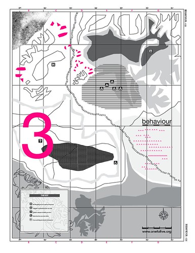
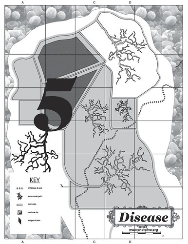
Project two - "Redesign Self Help leaflets"
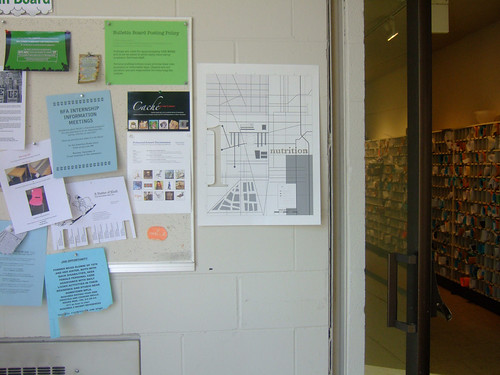
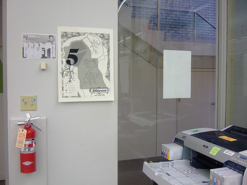
Micheal, Niccolo and I decided to work on this project together and although at times it was tough i loved working with them both they are both really talented graphic designers and together we created some lovely posters. we decided to use the form of maps for our concept with each map designed to suit the topic, it took ages but now there done im really proud.



Project Three - "Experiment with Tape"
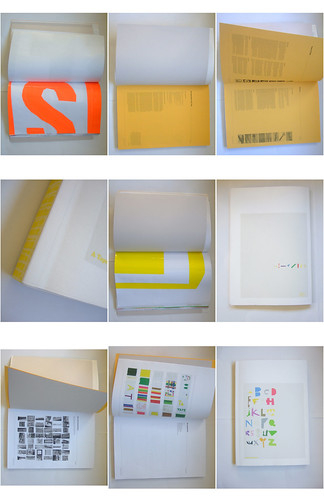
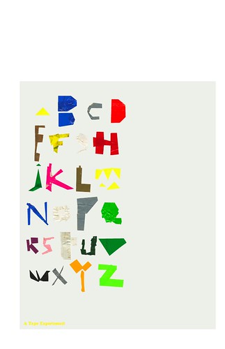
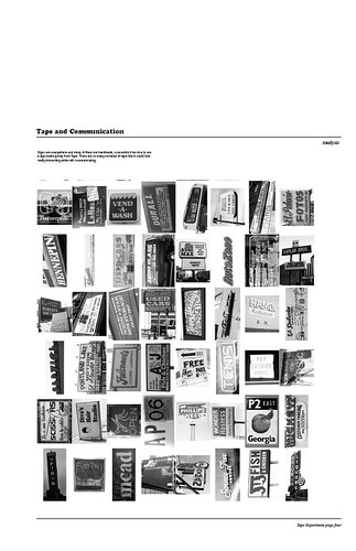
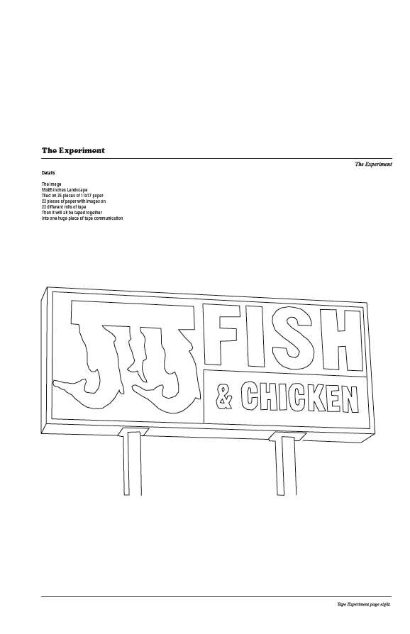
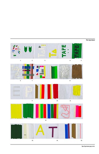
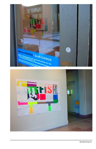
it was a really lovely project to end on we were basically allowed to jus play and have fun with anything we wanted and create an experiement from it! I decided to use tape and so made a huge sign from tape and then with the left overs made a typeface, it was so much fun and i now have a lovely book on tape that i made and i love :)
THE END :) :) :) :D

3 comments:
Millie!
Your work is amazing! I especially like the one with all the signs. Soooo good!
You (and MCAD) should be really proud!
<3tam.
BAM. And in 4 months you have a full portfolio. you should be proud!xx
Post a Comment